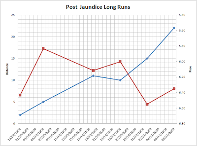
For example, the graph below shows my post-jaundice long runs. It was generated after playing around with the chart settings for 1 hour (not complaining, just wanted to check out all the options).
 Ah ... pure bliss!
 Ah ... pure bliss!
This is a personal weblog. The opinions expressed here represent my own and not those of my employer.
In addition, my thoughts and opinions change from time to time. I consider this a necessary consequence of having an open mind. This weblog is intended to provide a semi-permanent point in time snapshot and manifestation of the various memes running around my brain, and as such any thoughts and opinions expressed within out-of-date posts may not be the same, nor even similar, to those I may hold today.
Courtesy: Alex Barnett.
0 comments:
Post a Comment